THE STORY OF THE

![]()
(AKA, "Superman's Symbol 101")
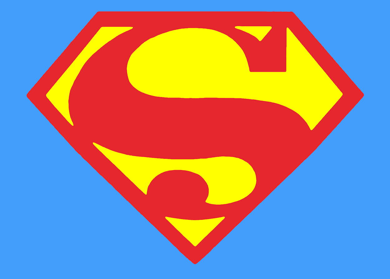
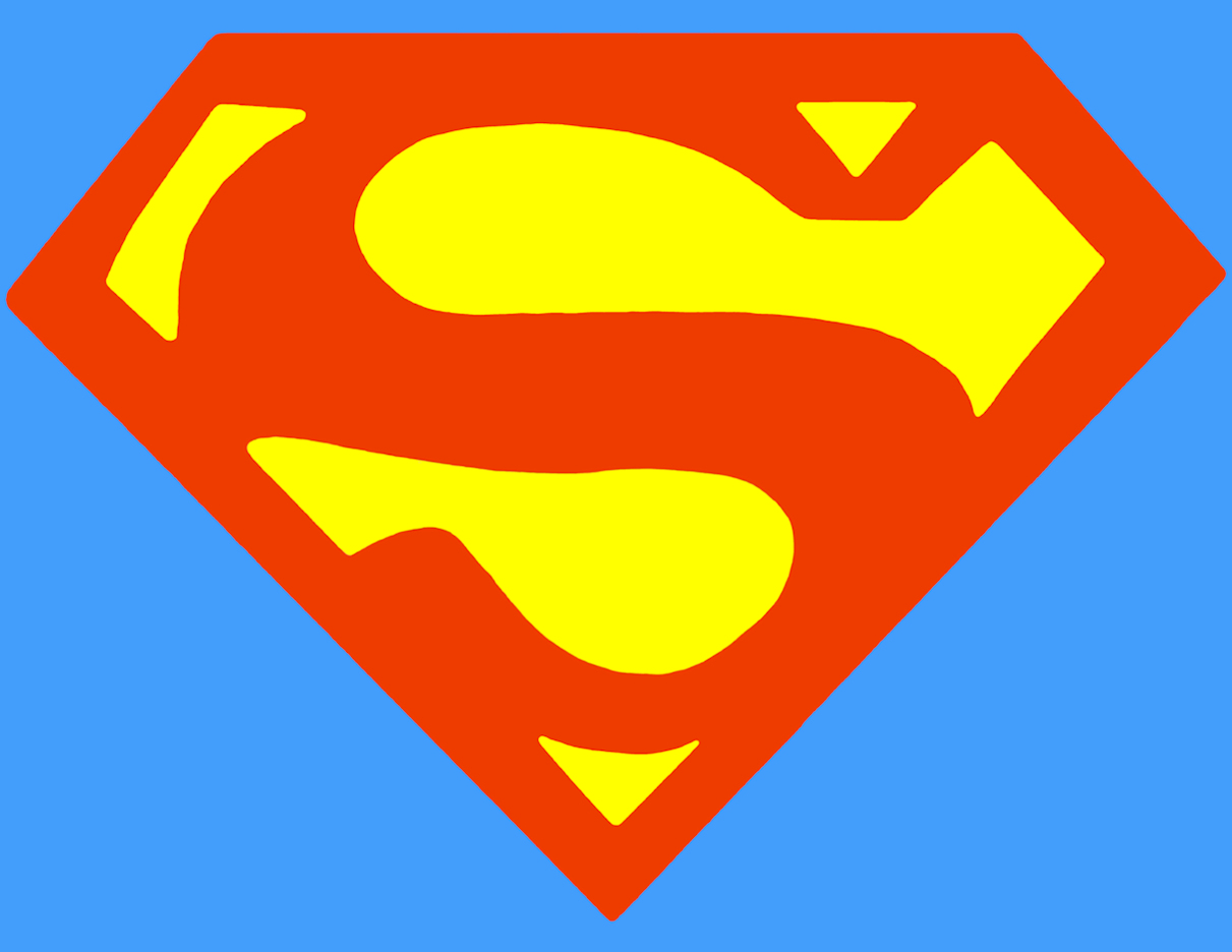
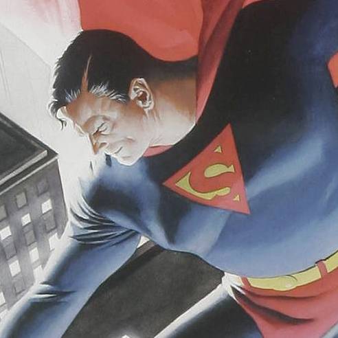
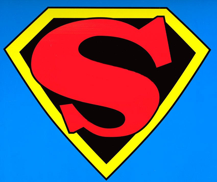
Superman's Symbol. Pop Art. An Icon. The Original. An unique piece of Americana.
Superman's "S" emblem is all of these things and more.
As it is, Action Comics #1 is the "Big Bang" of Super-Heroes. There is no "super" in "hero" before "Super" man, after all. And if the Super-Hero is the modern "mythology" in our culture, then Superman began a tradition that is steeped in historic iconography.
Symbols have power, and when Superman, the first and most successful Super-Hero in history, sported a Symbol on his chest, pretty much every superhero after that did, too (Batman, the Flash, Green Lantern, etc.). And not just the ones from DC, either - Atlas/Marvel did the same thing (at the beginning and even decades later, when they "reinvented" the Super-Hero) with Captain America, The Whizzer, Destroyer, Blue Diamond, Union Jack, Miss America, and then the Fantastic Four, Spider-Man, Daredevil and the lot of them. When people think "Super Hero", they think of someone with a cape, tights and some kind of icon on their chest.
Superman's logo is instantly recognizable and you can see it utilized in advertisements for pretty much anything you can think of when someone wants to emphasize what they're doing is at the apex of its ilk, to the extreme, of the highest degree, the greatest ever. When it comes to attracting attention, Superman's symbol carries the day .
It didn't start out that way, though. Initially, it was not even considered a significant part of his costume by his publisher. In hindsight, though, it turned out to be the most important, overall, toward the end of protecting and sustaining the ability to publish the character in perpetuity. Many hands drew Superman and his symbol, even in the formative years overseen by his illustrative creator, Joe Shuster. And the attention to detail took time to develop when focusing (if at all) on Superman's symbol. And many later artists since then have chosen (sometimes for nostalgia, other times simply choosing poorly) to re-use versions of the early symbols as homages to the early history of Superman. But, I digress...
Superman has been an icon for over 70 years and his symbol was the first of its kind. Prior to Superman, there was no such thing as a "Super-Hero", nor was there such a thing as a "Super-Hero Costume", nor was there a trademarked symbol that any fictional character had worn prior to Superman. As The Original Super-Hero, he and his symbol were the foundation upon which the comics industry has been built. There would have been no comics "boom" in the late 1930s, no Batman, no Sub-Mariner, no Human Torch, no Captain America, no Captain Marvel (Shazam! or otherwise) were there no Superman. There would be no DC Comics as we know it today. Marvel Comics would never have become a publisher of super-heroes and its Silver Age stable of characters (Spider-Man, the Fantastic Four, Iron Man, Daredevil, The Hulk, The X-Men) would be absolutely non-existent.
In 1945, National Periodical Publications (later simply known as "DC Comics") trademarked Superman's symbol, allowing the ability to print his stories in perpetuity, rather than allowing the printed material to become public domain after 75 years, as was the norm at that time. The ability to license and merchandise the character created another source of income for the comics industry.
Superman's symbol has become recognizable all over the world. However, at one time, it was not even very consistently drawn - and that is the crux of this article. Prior to having trademarked the symbol, it went through a great deal of metamorphosis (metamorphoses?). Here is the story as we know it.
NOTE: This page is currently under construction and will be updated as more information becomes available.
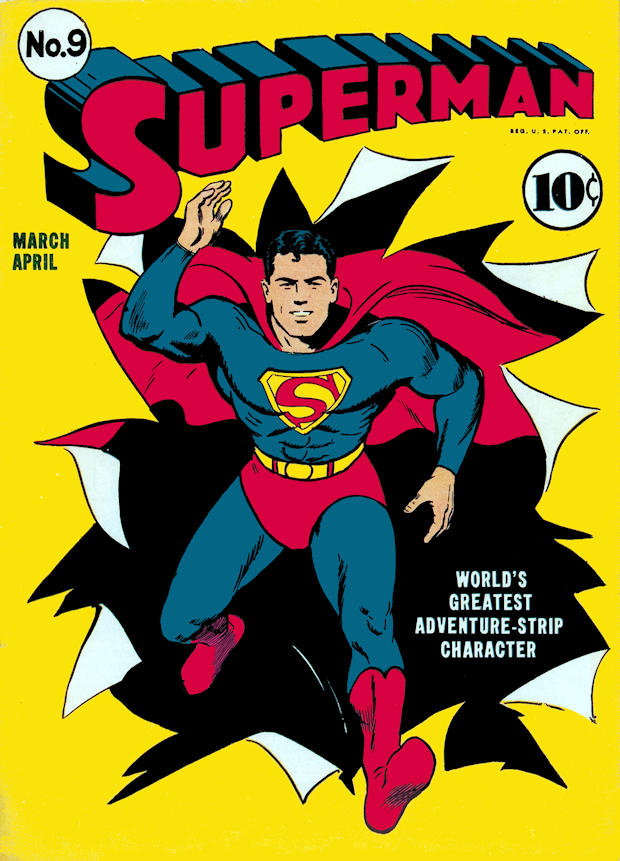
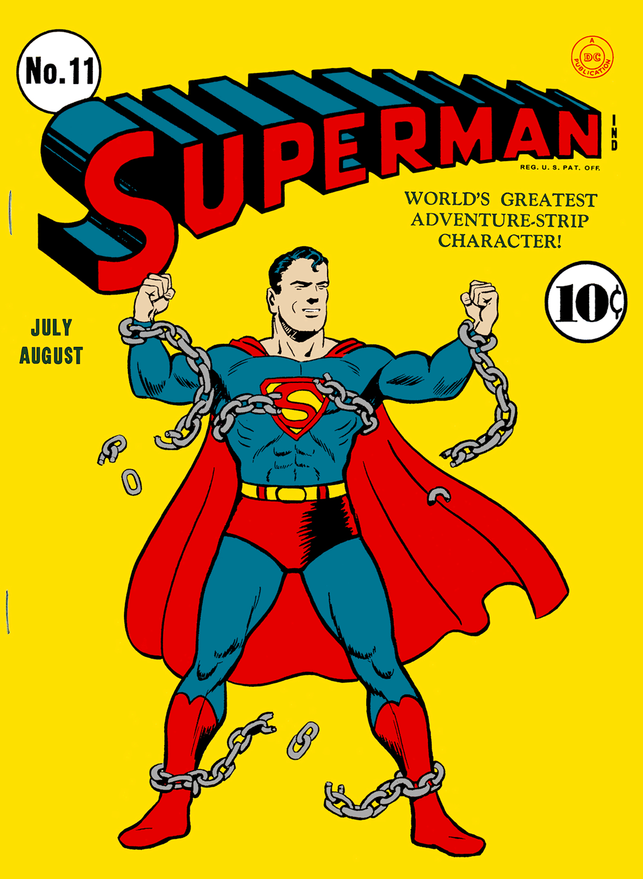
Metropolisplus.com has used primarily covers for the purposes of this article, as that is the part of the comic which attracted the most attention and were provided with the most detail and were printed with the best available reproduction of the day. We highly recommend the cover galleries for Action and Superman at The Grand Comics Database, which we have found to be extremely valuable for general research. While the images have been too small for our uses here, they were perfect for getting a fast look at 50 covers of one title at a time and being able to pinpoint the best covers to use.
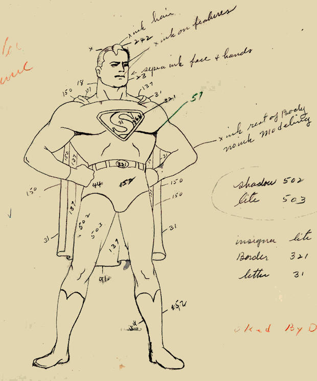
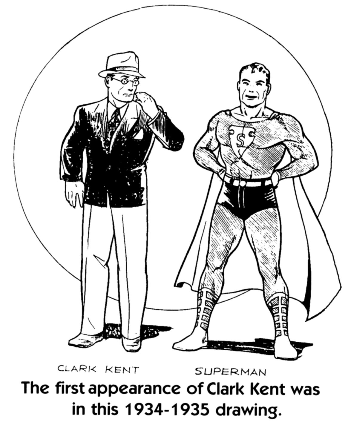
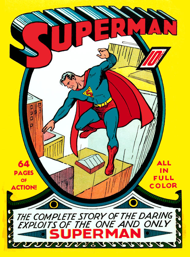
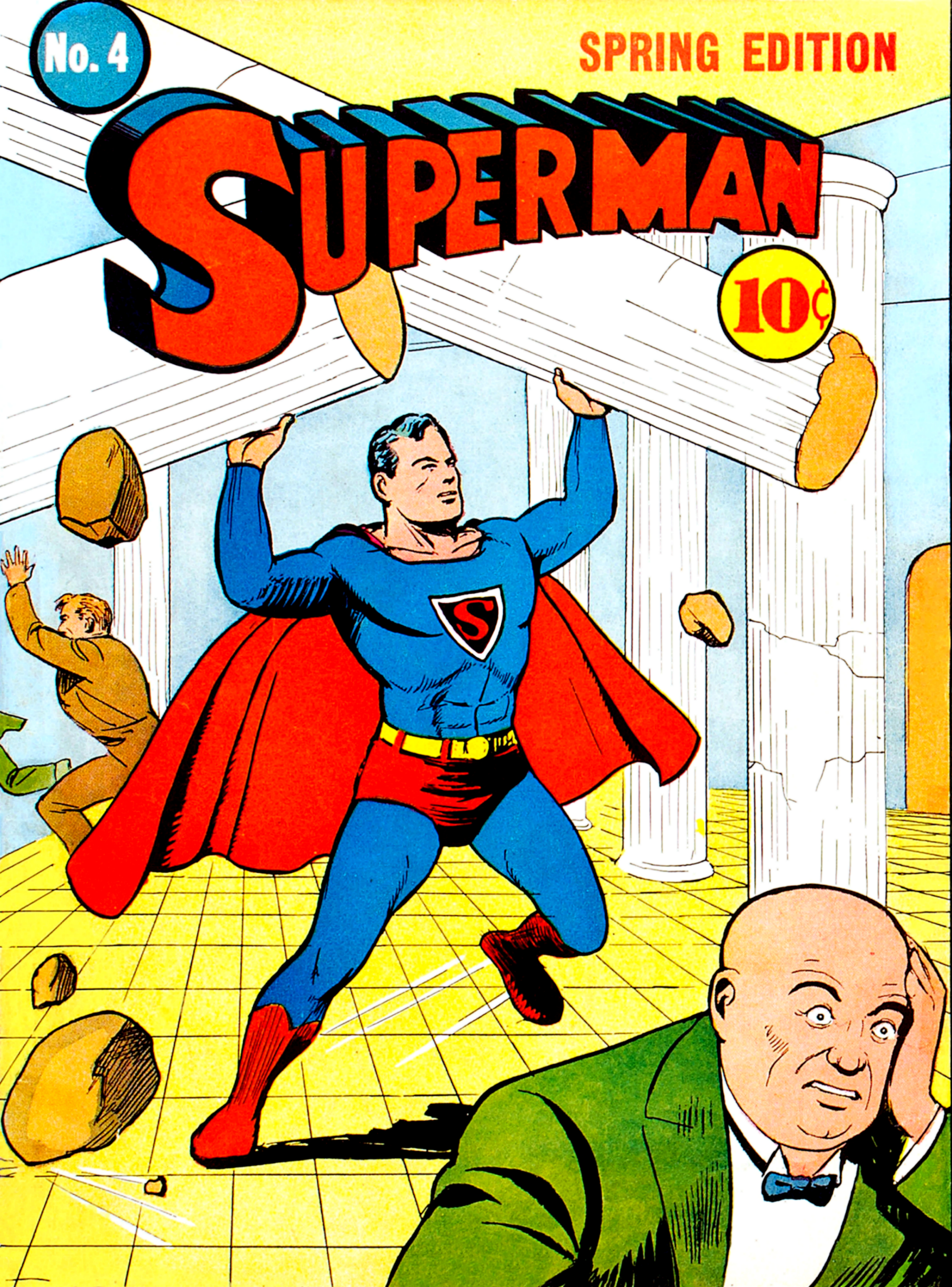
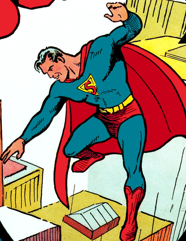
In reviewing the symbol itself, first one must point to the origins of Superman. Jerry Siegel and Joe Shuster had created Superman years before he ever saw print. Only a few early drawings of Superman prior to publication survive to this day. Here is one of them, as published in Comic Book Marketplace #36 (color added by our webmaster). As with all content on MetropolisPlus.com, all images are human-made, all text is human-written and all pages are human-produced (not AI):
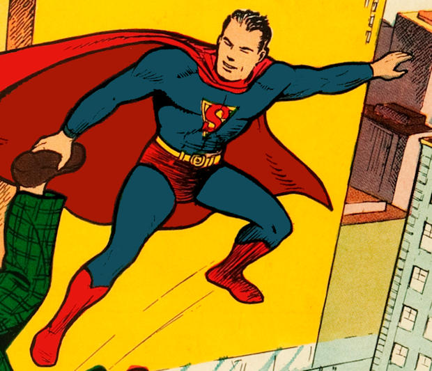
Click the picture to see the original black & white version.As you can see, this symbol was quite different than it would become upon publication, with the exception of the cover of Action Comics #1. Close inspection of superman's costume on the cover reveals that this was the same costume, boots/straps and symbol (this image was taken from Famous First Edition C-26, and we enhanced the coloring to follow the actual lines drawn for the symbol and the boots to clarify the image).
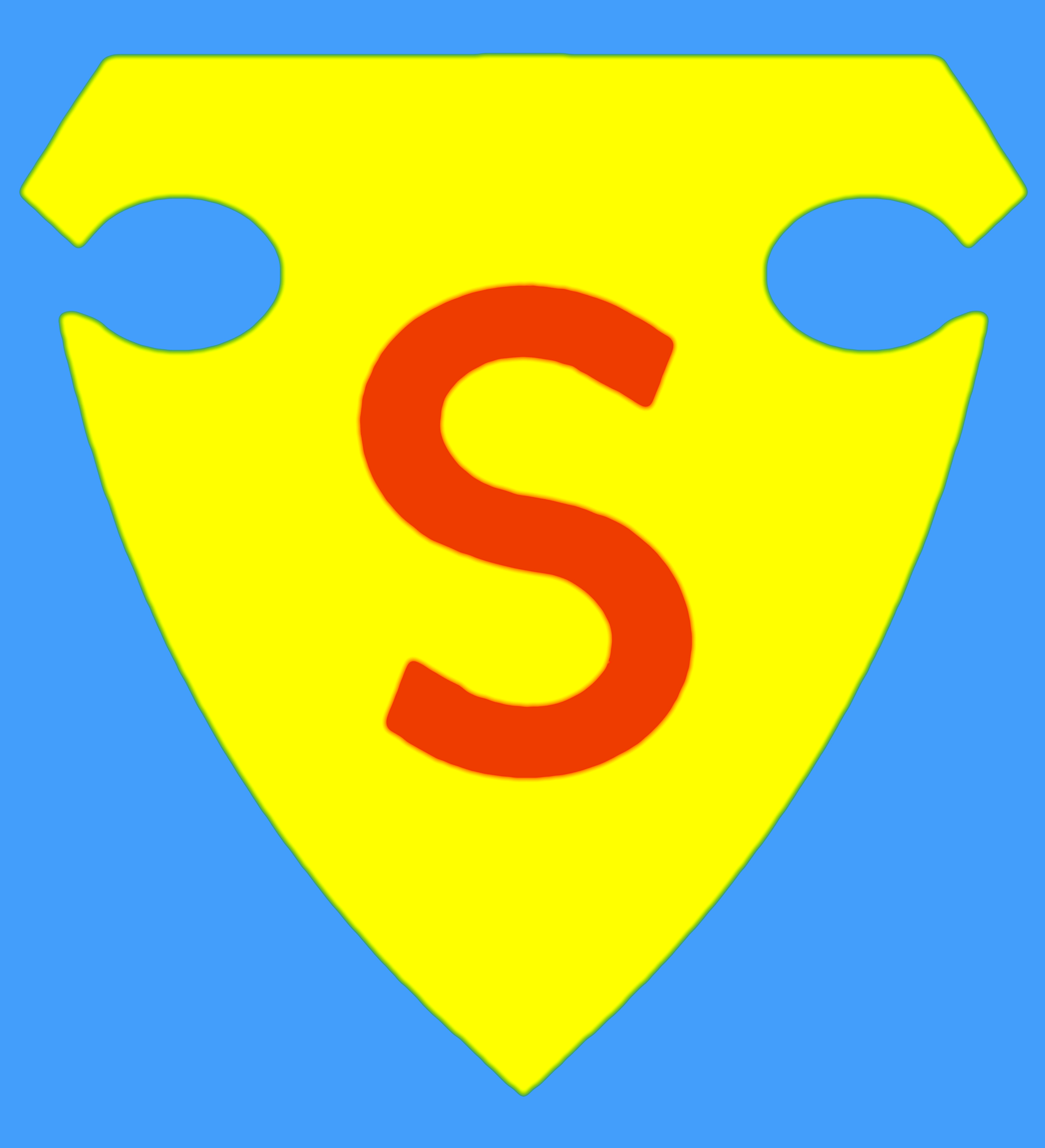
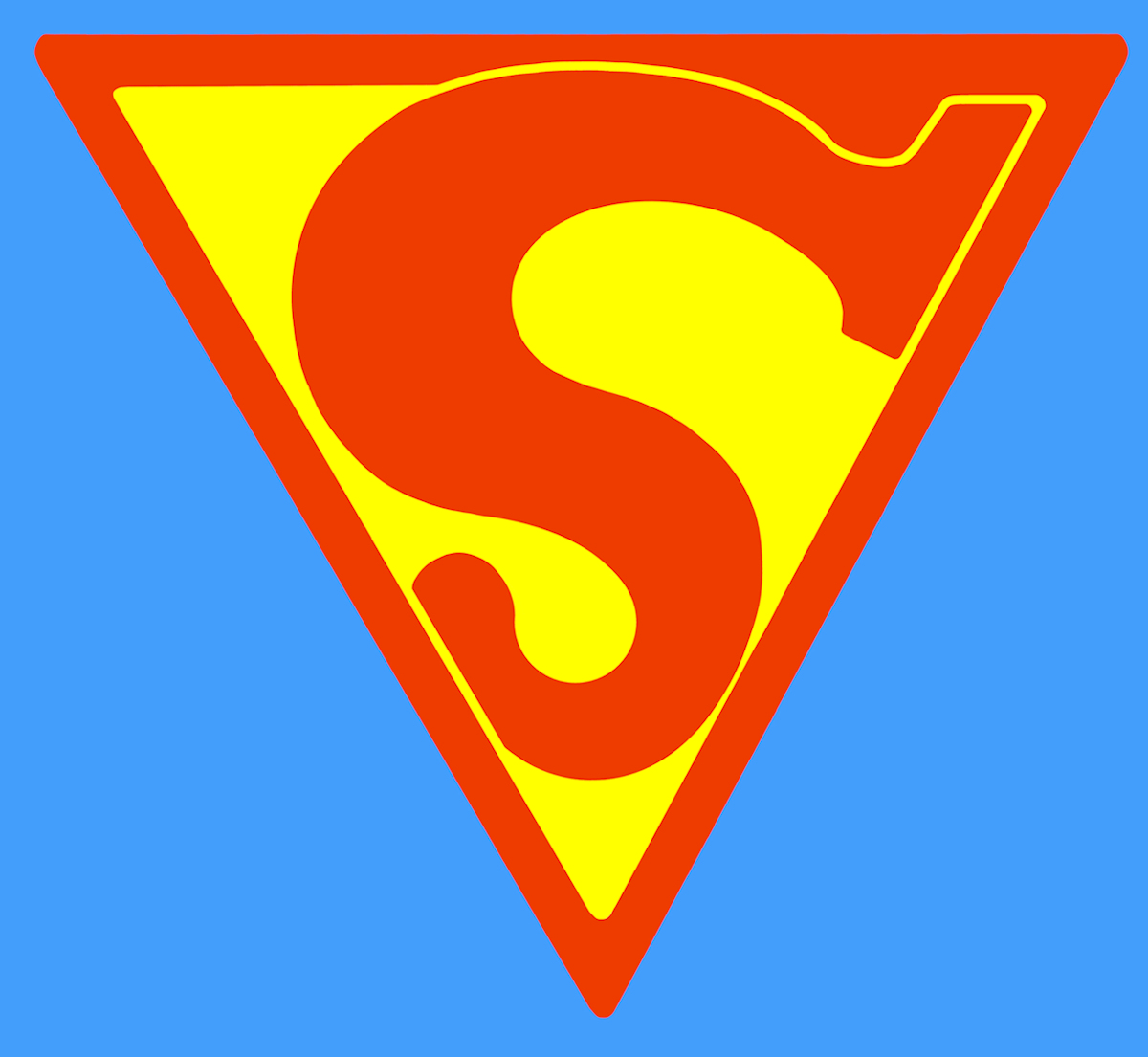
A representation of the first symbol in its earliest form provided for comparison (our webmaster's own digital painting). This shield represented something akin to the shape of a police officer's badge (which would later become the shape of the hand-held shield of a later hero known as "The Guardian", who was a police officer in his secret identity - but that's another story...).
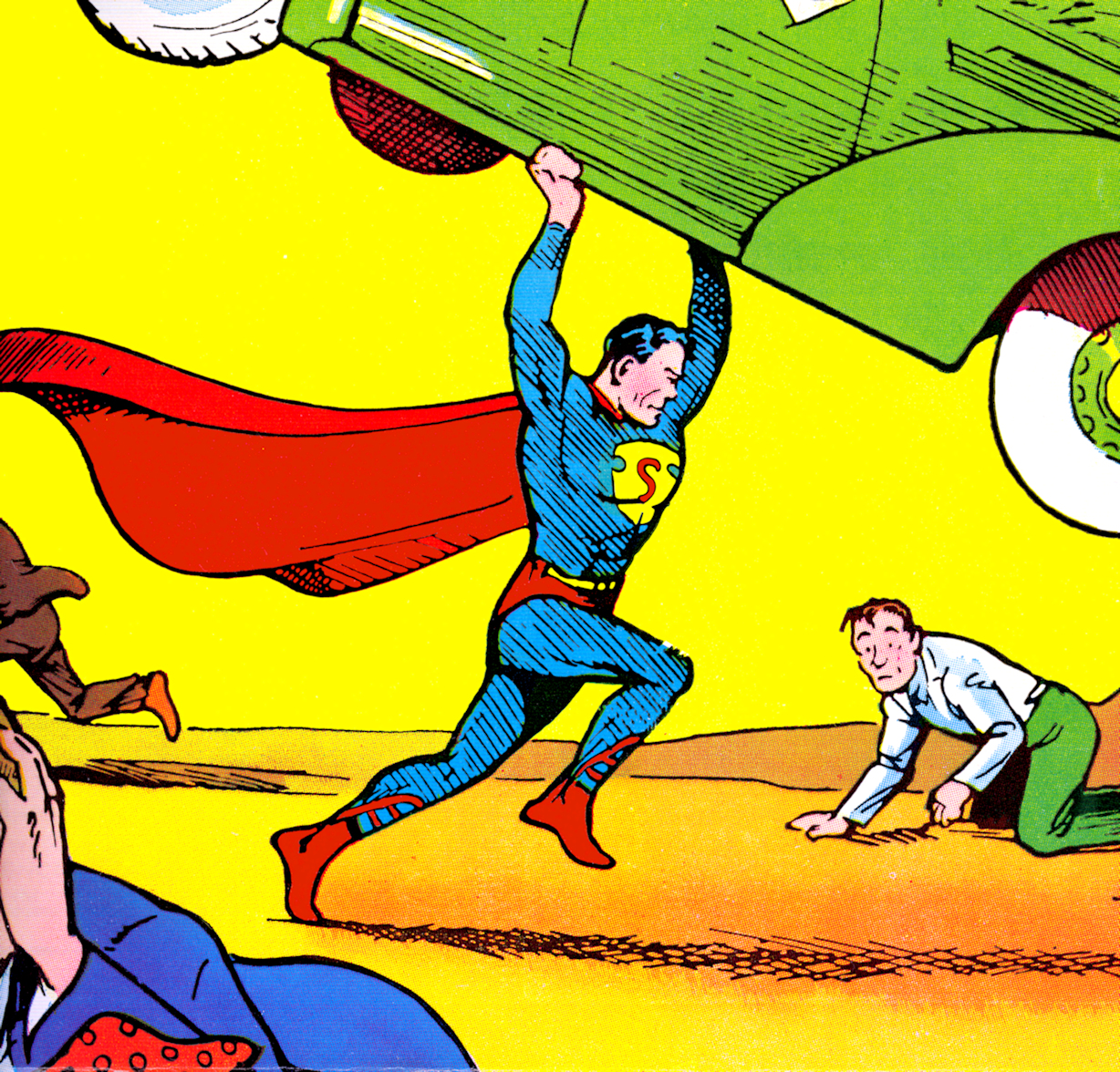
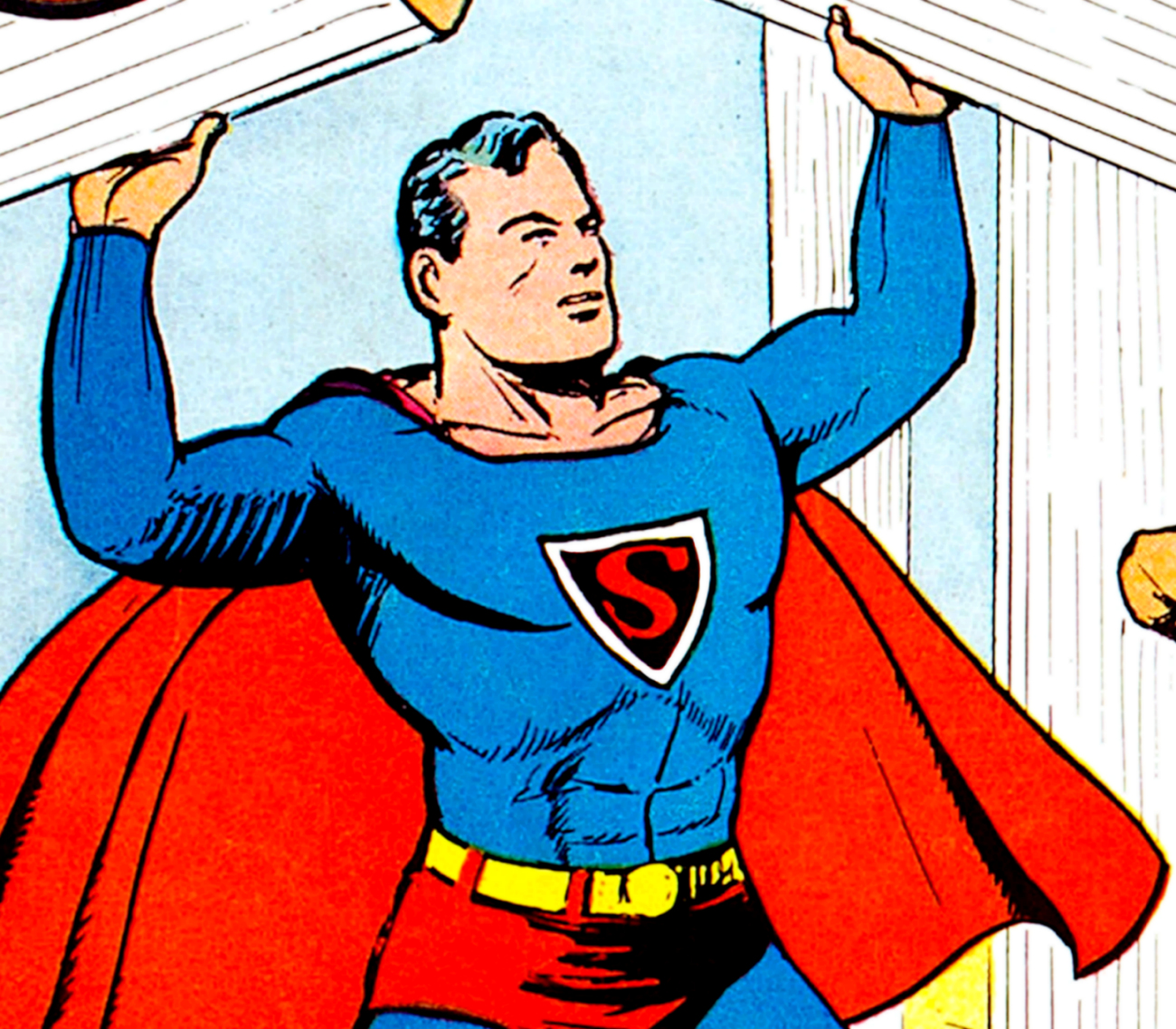
Jerry Siegel and Joe Shuster had intended Superman as a comic strip character, but had been turned down by numerous syndicates. When they prepared Superman for his first comic book appearance, Joe cannibalized the strips and reoriented them into page form with slight adjustments for the difference in medium. Superman saw newspaper publication a year after his first comic book appearance and his appearance was similar, but you can see from the examples below that there was a considerable difference once production started ramping up and Joe hired assistants like John Sikela in the studio, and the quality of reproduction made it sometimes difficult to maintain a consistent symbol - the initial focus was on Superman's facial appearance and the overall appearance of the costume. For the sake of simplicity, Superman's symbol takes on a triangular appearance in the pages of Action Comics, newspaper comic strips and the first few issues of Superman Comics.
This was the way the symbol continued to generally appear the interior pages as late as 1940 (our webmaster's own digital painting).
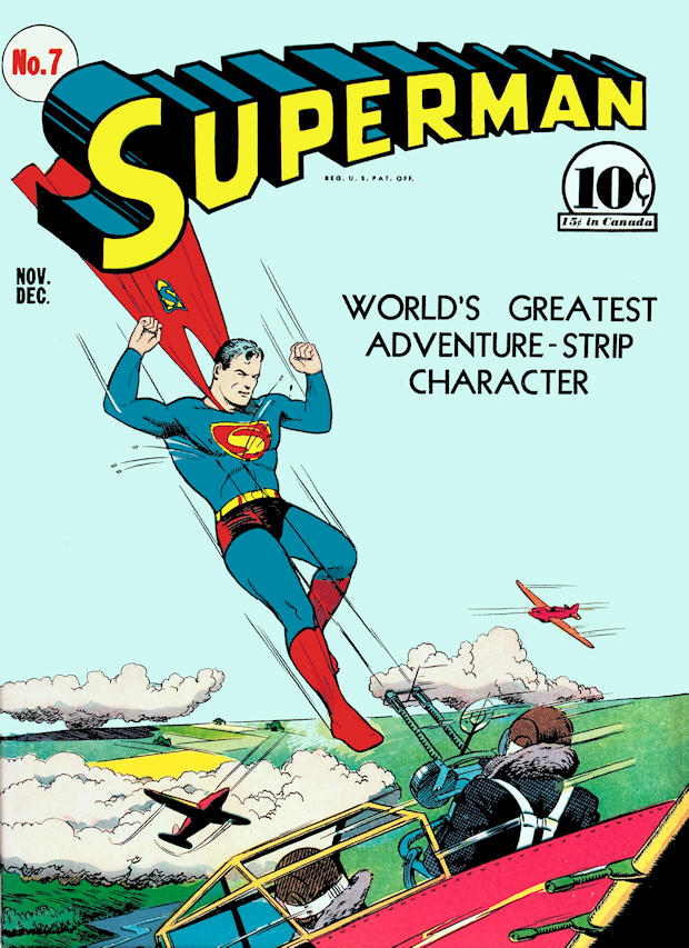
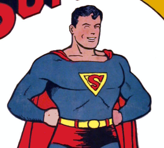
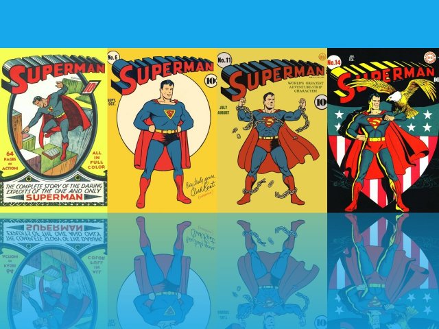
Here is the cover of Superman #1, which is, generally, the last appearance of the symbol in this form on a Superman cover.
Click for a detail of Superman #1.
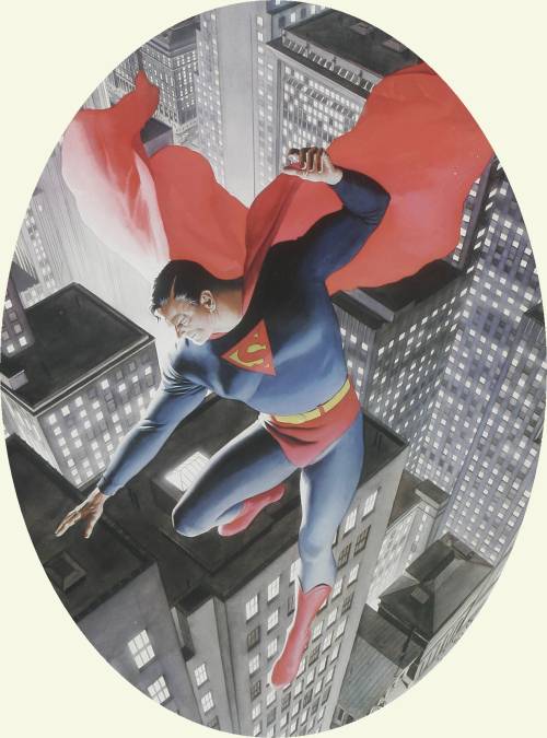
Alex Ross is a tremendous fan of this particular symbol and has used it in his representation of Superman #1, as well as using the above cover as the model for the statue he designed for The Ultimate Superman Collection:
Click for detail of Alex Ross's Superman #1.
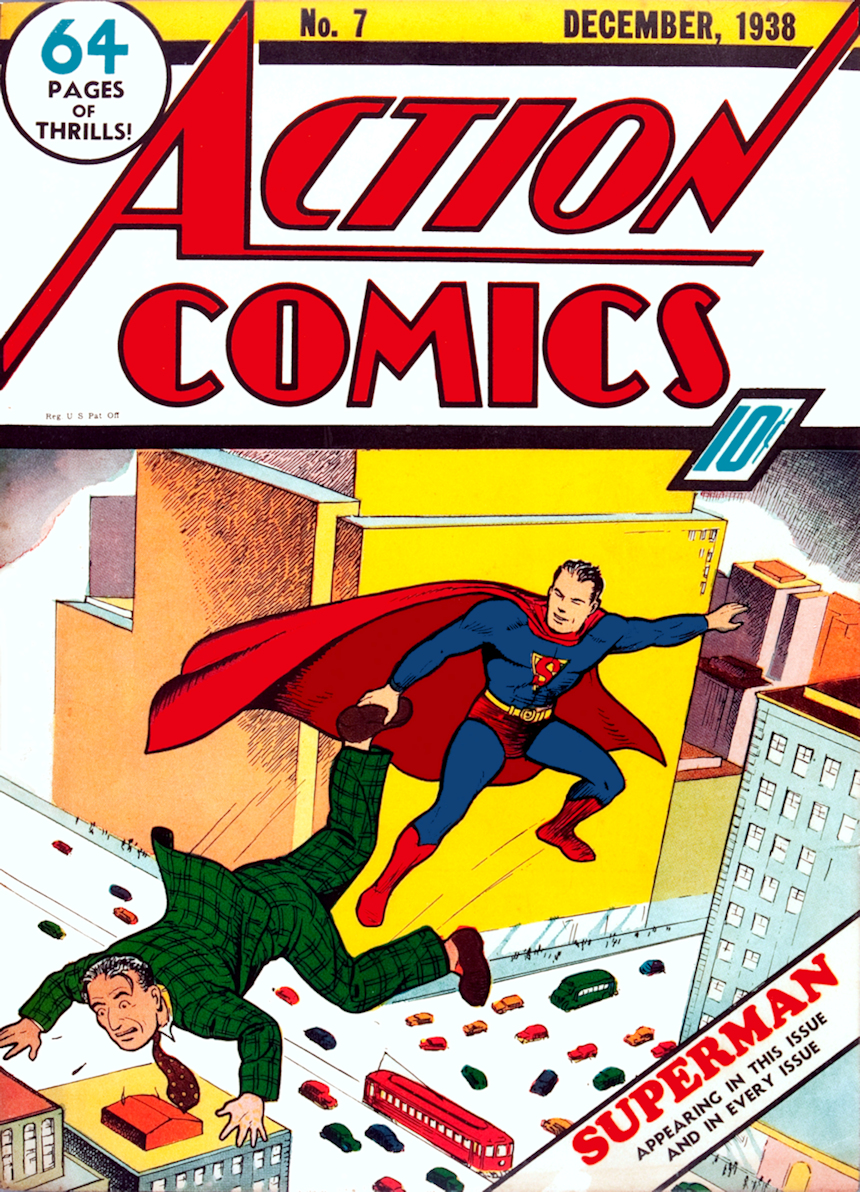
Superman only saw six other covers of Action Comics for the first 20 issues, one of which (#15 by Fred Guardineer) was a slight a misrepresentation of his costume. The second time we see him on the cover of Action Comics (#7), his symbol appears a bit more stylized - like it will become later - but on the interior pages, it is still an unadorned "S" in a yellow field inside a red-bordered triangle.
Click for a detail of Action Comics #7.
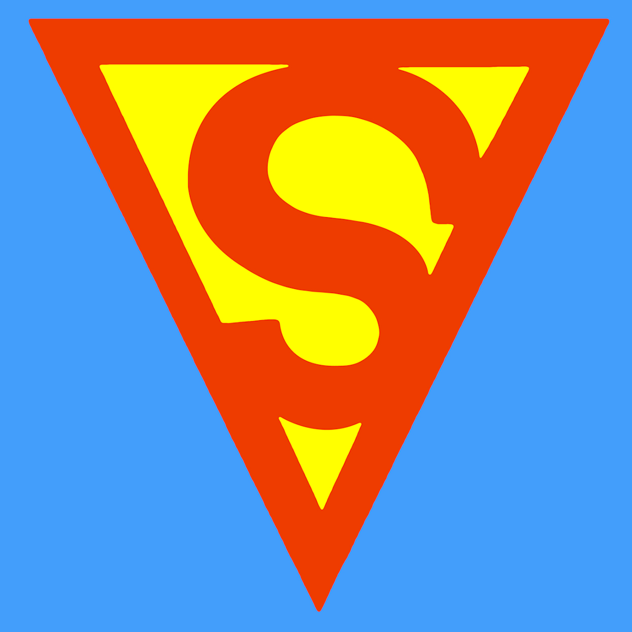
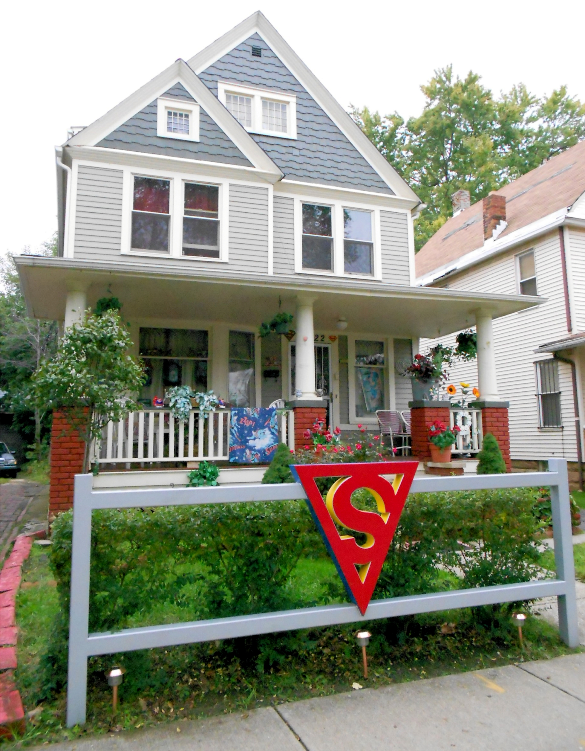
And here is a representation of the first "stylized" Superman Symbol (our webmaster's own digital painting).
The above painting was used by the foundation that restored Jerry Siegel's boyhood home (the birthplace of Superman) for a painted wood cut-out, which they have proudly featured on the front fence since the completion of its restoration in 2009:
On the cover of Superman #4 by Joe Shuster, the "negative" space around the "S" was filled in with black and bordered by yellow, which would inspire the look of the symbol in the upcoming cartoon - more on that below.
Click for a detail of Superman #4
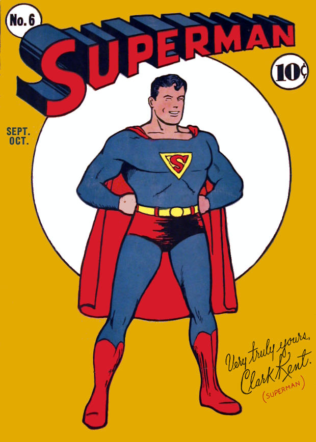
Once Shuster had a studio with many more artists, the symbol became a bit less sketchy (although, only slightly less so) and had a larger presence in Superman's costume. Take a look at the cover of Superman #6:
Click for detail of Superman #6.
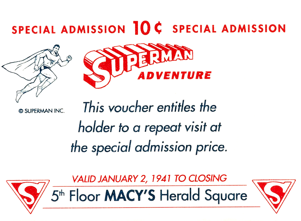
This stylized Superman's Symbol a bit more, adding serifs to the overall look. This style was also in evidence in Macy's event for the "Superman Adventure", a Superman-themed visit with the Man of Steel "in person" that took up floor space at the department store's Herald Square location. It was staged to be near the area in which children could visit Santa Claus in the department store in November 1940. The event continued through the beginning of January 1941 to round out rainchecks and canceled Superman appearances due to equipment failure. The remaining artifacts of the event have Superman symbols on them (below), resembling the style on the cover of Superman #6 (above).
A representation of this particular symbol (our webmaster's own digital painting).

Below is the version that was used around 1940 when the Fleischer Studios began their cartoon shorts of Superman, as seen here with black in place of the typical yellow coloring in the negative space and an outside border of yellow, rather than red:
Here is a representation of the Fleischer/Black Symbol (our webmaster's own digital painting).
While the black background and yellow diamond could have simply been an artistic preference, it appears to be an application of the Superman #4 cover symbol (see above), which appeared around the same time as the first Fleischer films. [Note: Comic book cover dates are much later than their actual appearance on the newsstands, as many newsstands pulled books based on their cover dates.] This approximate symbol also appeared as that used on the cover of a reprint reissue volume of Superman's comic strip adventures.
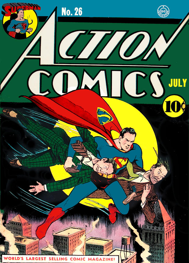
There were several versions of the symbol as it continued to be published. This cover by Paul Cassidy, published August 1940, was the first cover depiction of the next most popular version of the symbol. As Joe Shuster drew less and less cover figures and his "ghosts", like Fred Ray, John Sikela, Paul Cassidy, Leo Nowak, Ed Dobrokta and Wayne Boring began to work more and further into their own styles. John Sikela was known for his inking work on Superman's head and face, but drew many adventures signed as Joe Shuster. Fred Ray became well-known in his own right as a magnificent cover artist and Wayne Boring later became the main mechanism by which the property was wrested away from Siegel and Shuster - but that's another story. Below, this symbol had a bit larger "S" than is shown in most stories, but it is far more difficult to get a clear shot of the symbol on interiors, so this cover from Action Comics #26 serves as the first cover appearance of this symbol. Superman #7 follows suit, but mixes up the colors!
Click for detail of Action Comics #26.
There are many examples of the open-ended "S" in the pages of Action and Superman comics, but cover versions are a bit less frequent to find. Here's an example of this version, reportedly drawn by Joe Shuster, himself & inked by Wayne Boring, although the colors are reversed on the chest emblem.
Click for detail of Superman #7.
Click for Detail of Superman #7 with corrected colors (the "S" is red, guys!!).
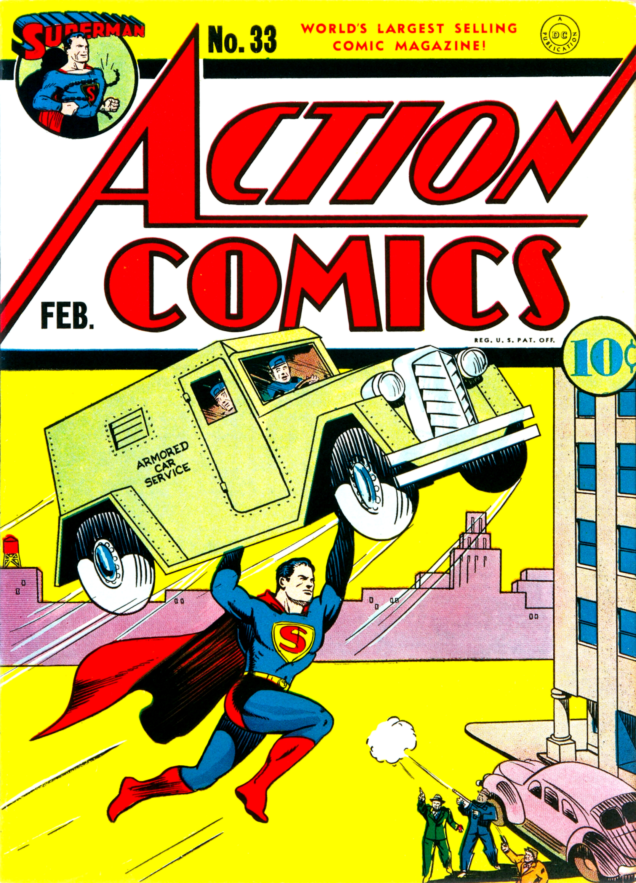
Another example of this is on the cover of Action Comics #33, although the ends are lined at the ends.
Detail of Action Comics #33.
A representation of the symbol as it appeared at that time in the comics' interior pages, circa 1940 (our webmaster's own digital painting).
There were no borders at the ends of the "S" and no contact with the outside border, as this is the way it appeared regularly in print in the interiors, mostly drawn by John Sikela and Paul Cassidy.
This was much closer to the current version, however, in late 1940, it underwent another odd change that went a bit further away from this version.
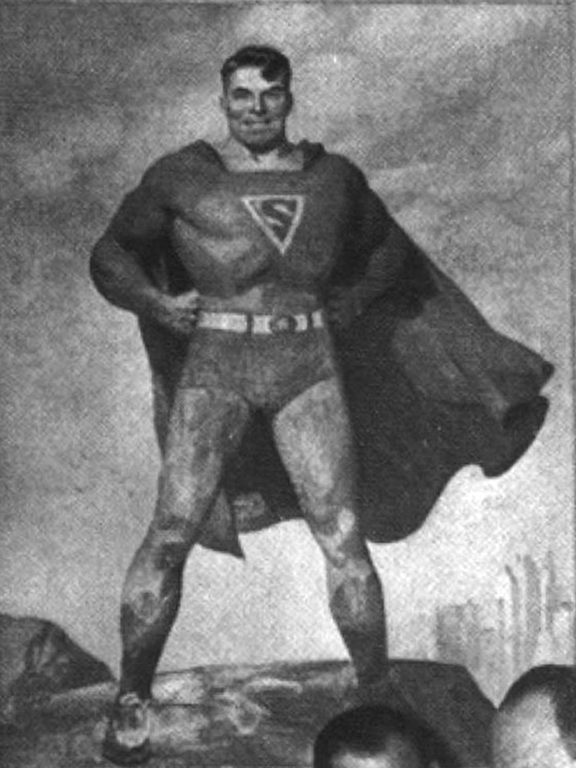
The National Comics offices had a painting of Superman by H.J. Ward. The only known photo of the original work appeared in a staged photo for an article in the June 21st, 1941 Saturday Evening Post. These photos provide us a sort of "before and after" version of Superman's symbol. Initially, before being altered, the symbol appeared in the early inverted triangle form. Like this:
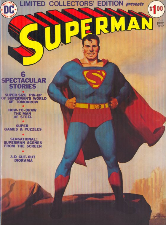
However, later, the very same painting had a much more elaborate version of the emblem. H.J. Ward's original painting was changed significantly. Joe Szokoli, who worked for Donenfeld in the pulp industry, altered the painting according to details in the copyright infringement lawsuit. At the time, H.J. Ward was extremely busy churning out paintings for Donenfeld's pulps, due to concerns that Ward may possibly soon be drafted into service in World War II. That painting (more famously having appeared as the cover of Limited Collectors' Edition C-31) now appears in Lehman College's Leonard Lief Library - this is a scan of the full canvas from Illustration Magazine #29 (2010):
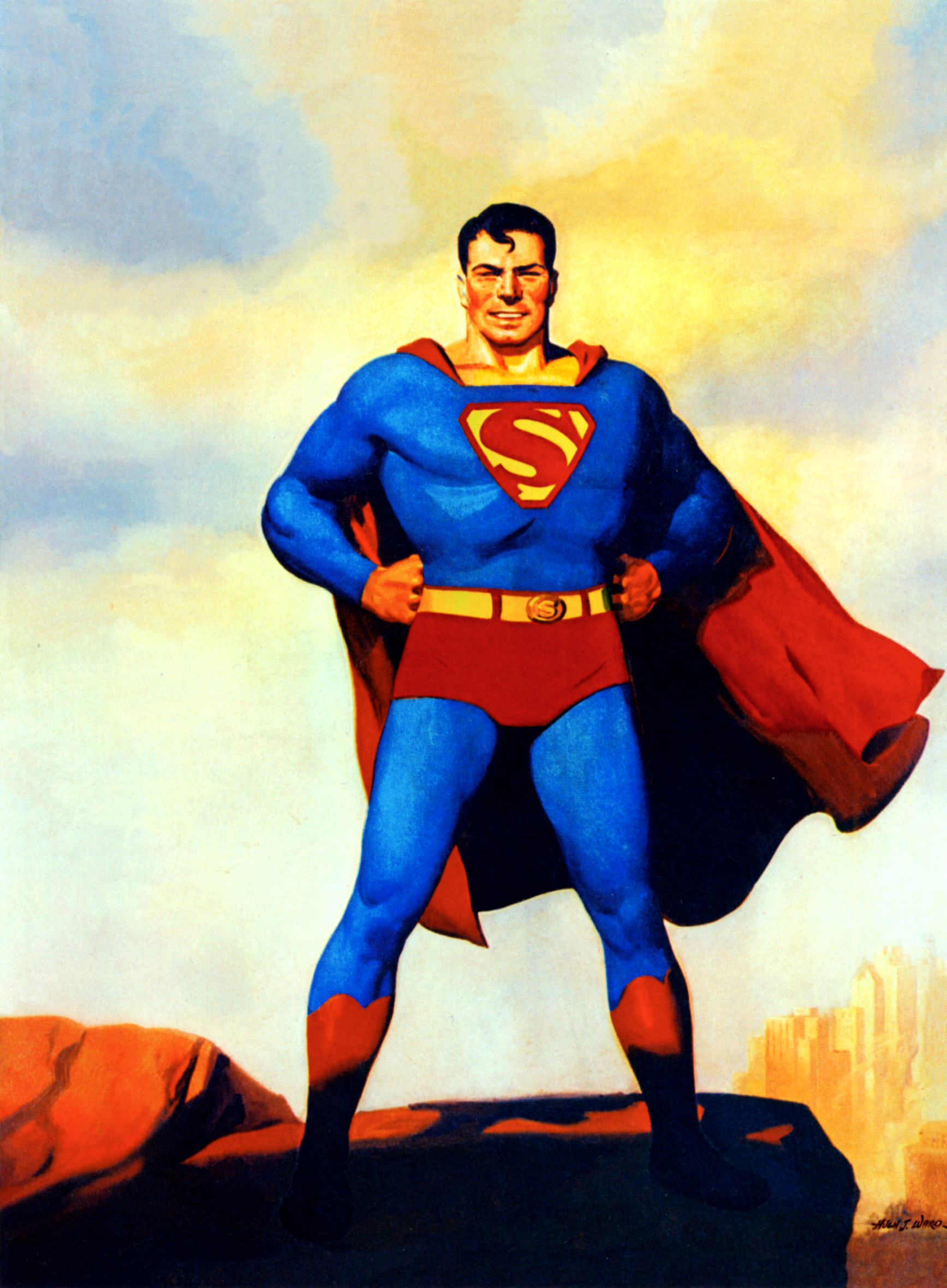
Here is a representation of this version of the symbol (our webmaster's own digital painting).
The painted symbol had never appeared in print until 1974, when DC Comics published Limited Collectors' Edition C-31, which used a photograph of the H.J. Ward painting as its cover. Later, in a story entitled "Superman Takes a Wife!" in Action Comics #484 1978, Curt Swan used the Ward symbol. The subsequent "Mr. & Mrs. Superman" feature in Superman Family, drawn by Kurt Schaffenberger, also used this symbol - however, even for Schaffenberger, who drew one of the most neatly and consistently rendered Earth-1 Superman symbols, it proved to be difficult to depict with any real consistency. Here is a representation of Curt Swan's version of the Ward symbol:
With Superman #9 and #11, published in 1941, a difference from the initial triangle shield began to take form. The symbol appeared more as a diamond and with the serifs becoming prominent and this is how the Golden Age symbol was typically represented when artistic reference was used for the Golden Age/"Earth-2" Superman being depicted:
Click for detail of Superman #9.
A representation of the Golden Age emblem in color (our webmaster's own digital painting).
That version of the symbol appeared on covers through December, 1943.
Some Fred Ray covers also had a different serif, a little more closely resembling the painting by H.J. Ward, such as Superman #12.
Click for detail of Superman #12.
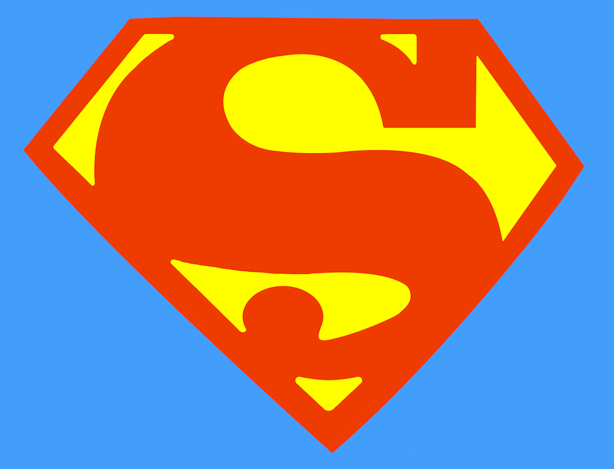
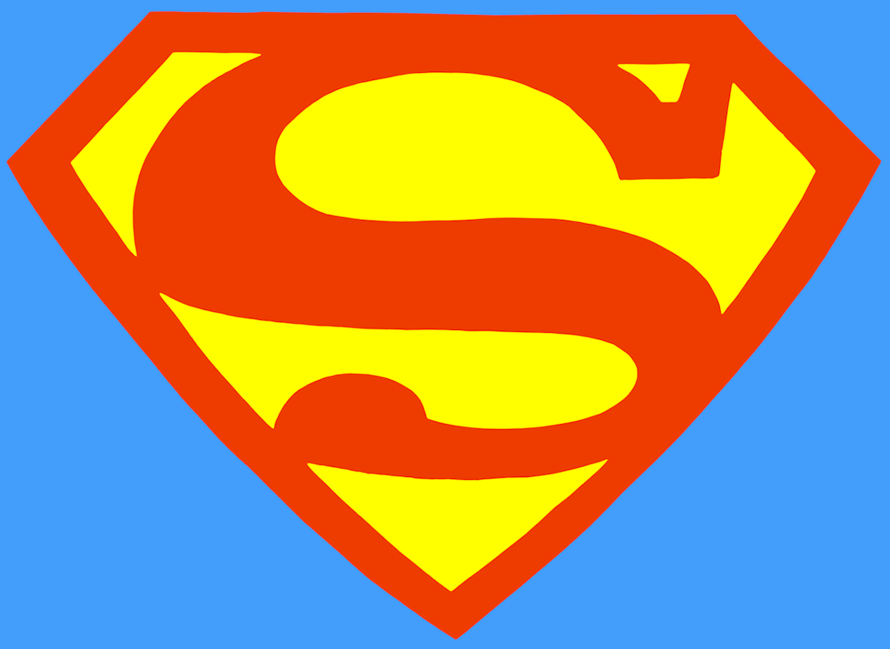
There was one further evolution, which may have been due to National realizing that this property had "legs" and was going to be around for awhile. In order to be able to keep a property in publication for longer than 75 years, one would have had to trademark part of that character's appearance. Disney did it with Mickey Mouse and Superman was much easier to pull off, due to the emblem on his chest. In 1944 - the very next issue after Superman 25 - the trademarked version of the symbol appeared.
Click for detail of Superman #26.
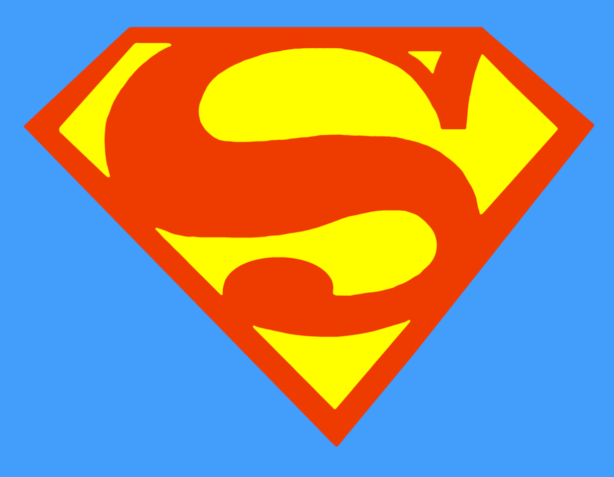
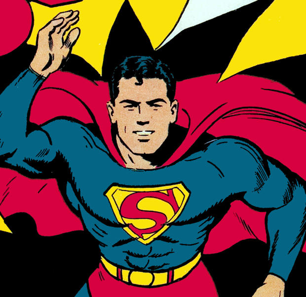
Probably the most popular Superman artist of all time still had to be Curt Swan - whose work would not only define Superman's symbol, but Superman as a whole for the second half of the 20th century - is depicted here.
And the symbol as the general public became accustomed to seeing it for about the next 50 years (our webmaster's own digital painting).
Shortly after Curt Swan began drawing Superman with regularity, the idea of parallel Earths was introduced. The Justice Society and Justice League of America both existed in parallel universes. So, working backward a bit, starting with Superman #8, you can see that artist Fred Ray (a Golden Age favorite around here), began a series of covers for Superman's eponymous comic book. Through issue #18, he created some of the most iconic images of Superman. He had redesigned the Superman symbol - most obviously with issue #9 - and then tightened it up even more with issue #12. By Superman #18, the new image of Superman's "S" was ingrained and the next series of covers were drawn by Jack Burnley, who continued to utilize this version of the symbol through Superman #25.
Those images were so popular that, when Earth-2 was introduced - featuring the Golden Age super-heroes of DC's past - there became a movement among the artists to differentiate the symbol of the two "Supermen". Most of which involve Dick Giordano.
The first example of this movement was started by none other than Murphy Anderson in Justice League of America #76 (on sale in September of 1969) which featured a double-page spread featuring the Justice Society of America by the artist (see our restoration of this piece, here), which differentiated the Earth-2 Golden Age Justice Society of America from their Earth-1 counterparts by several degrees. Batman wore the bat-symbol without a yellow border and Superman featured the Fred Ray redesign of the symbol.
Justice League of America #82 (on sale in June of 1971) featured a cover by Neal Adams and Dick Giordano that had the Earth-2 Superman featured in the background, in which he had an old, even earlier (approximately Superman #6 period) version of the symbol (the interior pages appear to have Dillin making an attempt to differentiate the symbol, which may have been "corrected" by inking, but without the original art, it's impossible to tell).
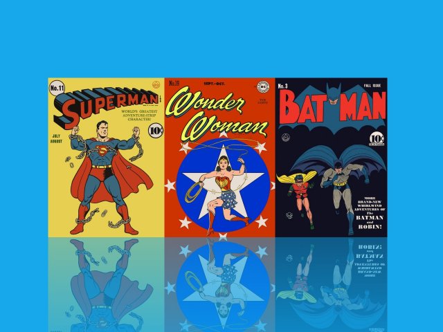
The same team duplicated this version of the symbol on the back cover of DC 100-Page Super Spectacular No. 6 (July of 1971). The cover by Neal Adams and Dick Giordano features the Trinity in the spotlight (Superman, Batman and Wonder Woman), although with the Golden Age/Earth-2 Wonder Woman, since the Earth-1 Wonder Woman had been de-powered and was not wearing the traditional Wonder Woman uniform. On the back cover (far left, at the top) we see Kal-L from Earth-2, who has a slightly different symbol (same as they drew on JLA #82, above). Easy enough to get by the editors who were overly protective of this logo, which was trademarked, after all. You'll notice that between Adams and Giordano, the Superman symbol on the front is exquisitely and perfectly rendered - as is most everything else on the entire cover. That difference in the symbols is neither laziness, nor a mistake.
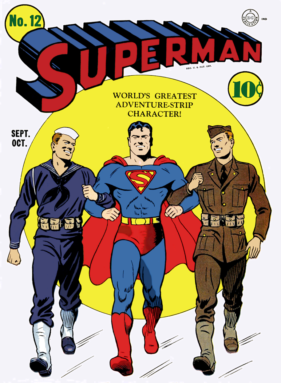
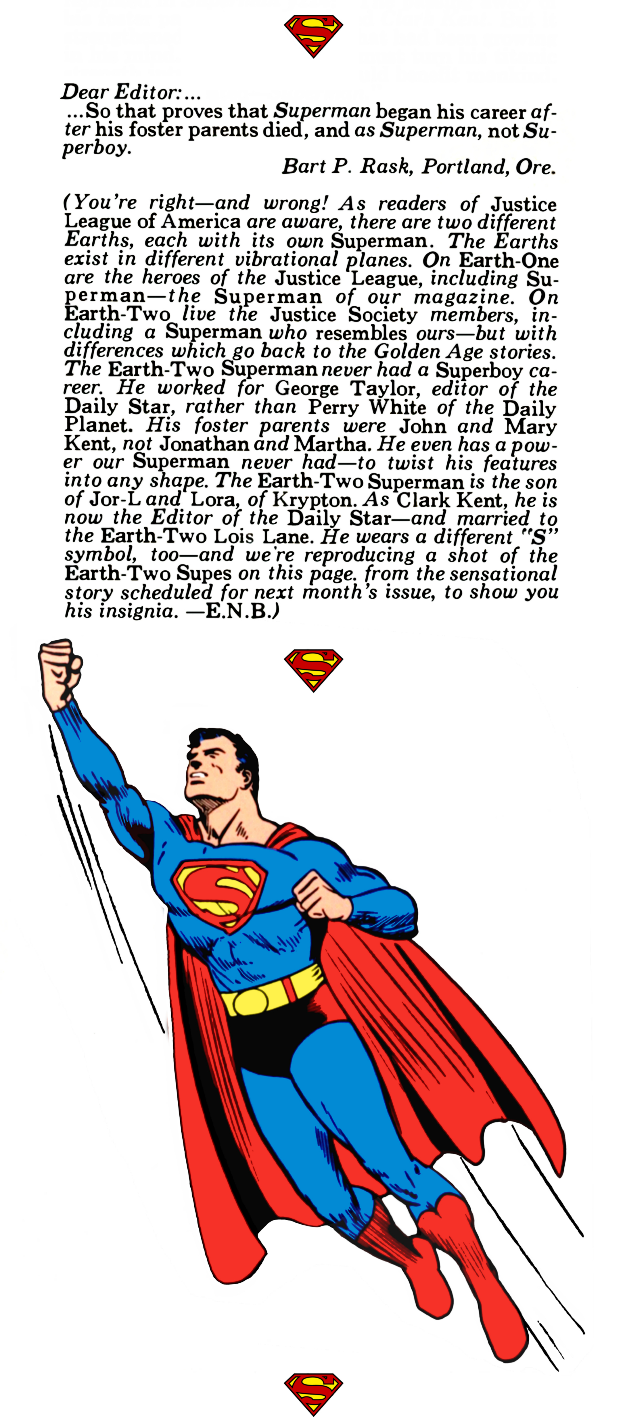
In between these last two events, in the letters column of Superman #253 (April of 1972), editor E. Nelson Bridwell had clarified the difference in the symbol in response to a letter writer who insisted that Superman from Action Comics #1 had no Superboy career and that Superboy should no longer exist:
And that story "I Sustain the Wings!", from Superman #25, didn't appear the following issue because of the change in content size (from 52 pages for 25¢ to 32 pages for 20¢), so - instead - they included it in the next Superman-themed DC 100-Page Super Spectacular (DC-18), which didn't go on sale until April of 1973.
Later, in Justice League of America #107 (June of 1973) Dick Dillin and Dick Giordano drew Kal-L clearly sporting the Golden Age symbol popularized by Fred Ray.
So, with the exception of a few glitches, here & there afterward, this symbol came to represent the Golden Age, Earth-2 Superman, counterpart of "our" Earth-1 Superman. Moving forward again...
We can't forget what an impact "Crisis on Infinite Earths" had on the DC Universe back in 1985. The last page of the first series of John Byrne's Superman depicted the symbol thusly:
The symbol as it was presented from the John Byrne era on (our webmaster's own digital painting). Further down, you'll note that it rather closely resembles the 1960s animated cartoon version, having taken on cues from both Curt Swan and Kurt Schaffenberger. Schaffenberger (also below for reference) had more bulbous circles when he drew the symbol, as well as an uneven diamond (the downward slope on the right being lengthier than the left and both angled more shallowly). Byrne has evened up both downward slopes, but has also incorporated some more circular hallmarks to the symbol, overall.
For comparison's sake, we've provided a collage of all these symbols. A Contrast from one period to another.
As mentioned previously, Superman has been Alex Ross's favorite character and Kingdom Come, like any story about heroes in the DC Universe, was a Superman story. When Superman reappeared, his symbol took another turn in it's constant morphing. Alex was quoted as indicating that he had always liked the way the Fleischers used black in the negative areas, so he created a deceptively simple design utilizing that idea.
The symbol as it was presented by Alex Ross in "Kingdom Come" (our webmaster's own digital painting).
You think the TV and Movie representations were perfect? Not quite! Each, individually, has been the industry's best tries to date, certainly - but none of them have been made with quite the precision we find in the drawn versions.
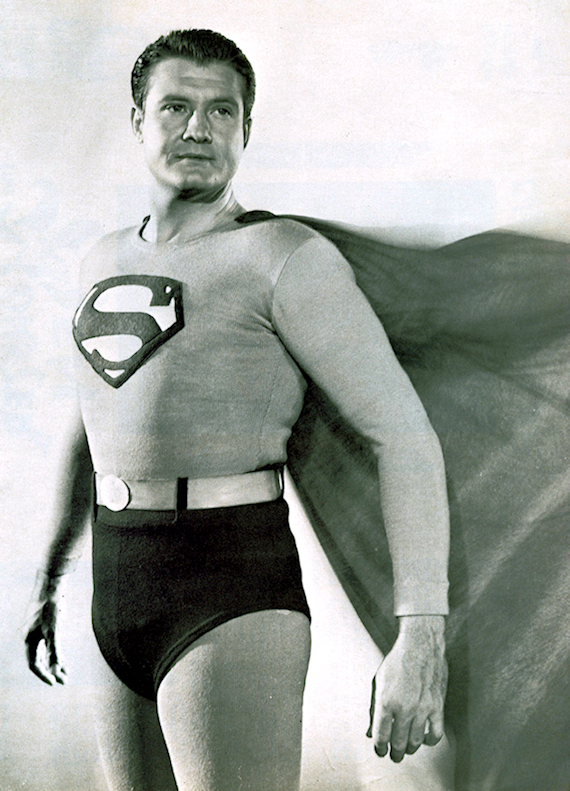
George Reeves had a laudable try in "The Adventures of Superman" on television (the same suit was originally used in the Kirk Alyn serial).
Here is a representation of the symbol taken directly from a head-on photo of this original costume (our webmaster's own digital painting).
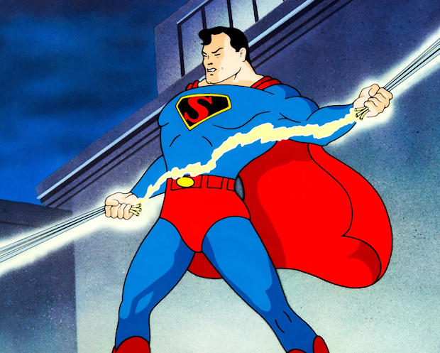
Probably the best representation on television was the symbol used in "The New Adventures of Superman", an animated Saturday morning cartoon. Seen here is the way the symbol was represented in the title sequence (our webmaster's own digital painting). It appears to be an amalgamation of both Curt Swan's symbol, as well as taking cues from Kurt Schaffenberger's symbol, which I've added for comparison (below). The hallmarks of Schaffenberger's symbol are that the right side is elongated at the downward slope of the diamond, making the size of the "arrow" pointing to the right much larger. Schaffenberger also draws the downward slopes on both sides at a narrower angle, making a narrower diamond overall, as well as having a more circular sense to the negative space of the top yellow oval. This one tends to have more evenness to the sides like Swan, but also has the large arrow, due to the extension of both downward angles, making a slightly wider shield overall:
Here's the Kurt Schaffenberger Superman shield for comparison (our webmaster's own digital painting):
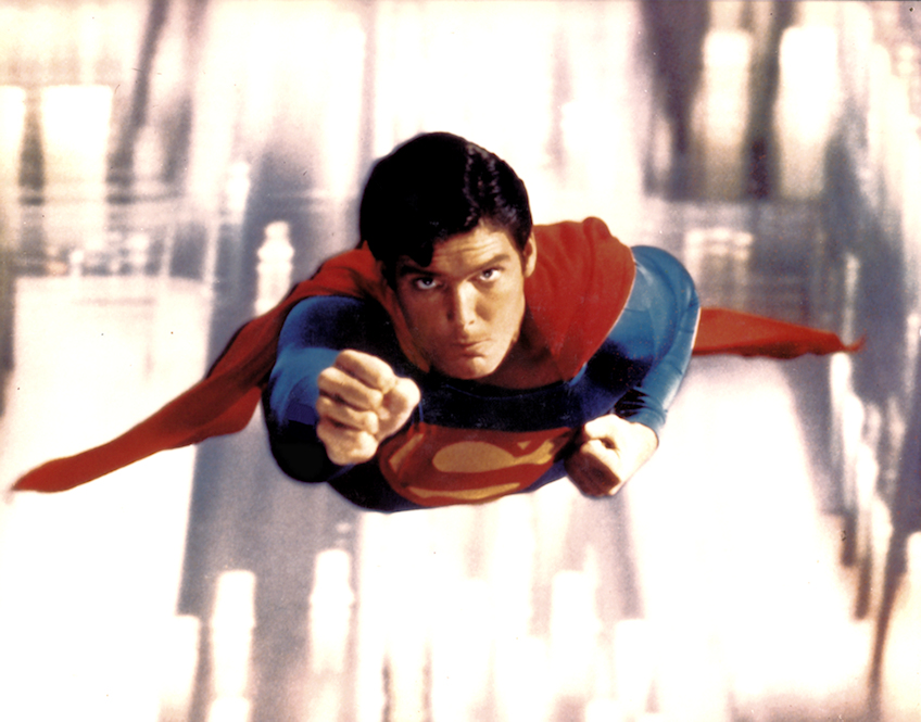
Christopher Reeve had another very close attempt in the "Superman" movies.
Here is a representation of the symbol taken directly from a head-on photo of this original costume (our webmaster's own digital painting).
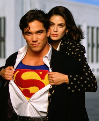
Even closer was the symbol from the late, great TV series, "Lois & Clark: The New Adventures of Superman", in which Dean Cain played the titular male character.
Here's a representation of that selfsame emblem (our webmaster's own digital painting).
As we neared the premier of "Superman Returns", we were consistently reminded of the importance of Superman's symbol. The trailers and teasers utilized it repeatedly and it stirred the emotions of moviegoers and web-surfers everywhere. While previous live- action versions of Superman in film or television had not quite perfected the art of the "S" shield, this one tried a new tactic by going with a plastic relief (3-D) version that was not only on his chest, but they included one on his belt... okay, maybe not my favorite choice. But I appreciated the efforts to honor the Donner movies with Christopher Reeve.
The version used in the 2006 movie "Superman Returns".
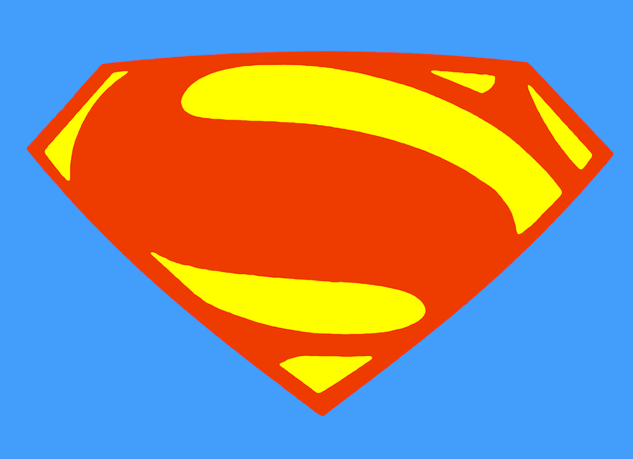
Our Webmaster also appreciated the callback to the symbol used by the Superman of Earth-2 (as represented above) in the 2010s for the Zach Snyder Superman films (irrespective of the depiction of Kal-El, overall). The version worn by Henry Cavill as Superman in "The Man of Steel", Batman v. Superman: Dawn of Justice" and "Justice League" (our webmaster's own digital painting) represented here.
Lastly, recent productions in both animation and the 2025 film have further played with Superman's symbol. Let's first provide a representation of the symbol used in the animated show "My Adventures With Superman" (abbreviated "MAWS" on Reddit and other online areas of discussion) from 2023, in which Superman is voiced by Jack Quaid:
And, lastly, we present the most current movie version of the symbol worn by David Corenswet in the 2025 James Gunn film "Superman" - harkening back to 1996's "Kingdom Come" and the Alex Ross future version of the symbol, except with its typical colors, rather than black in the negative spaces:
We hope you enjoyed this complete waste of your time - we certainly did!

PS - Here is a project that was based on of the above information - take a look at Marcus Parcus' reimagining of Superman's costume from 2008!Android Wallpapers:
Please take a moment to check out the other sites on metropolisplus.com:
DC ANIMATED UNIVERSE (DCAU) VIEWER'S GUIDE - NEW 2022, UPDATED 03/2025!
SPINNER RACK REMEMBRANCES - UPDATED 03/2025
COMIC BOOK PIETA COVERS - UPDATED 03/2025
WITH ONE MAGIC WORD... SHAZAM! THE RESURRECTION OF THE *ORIGINAL* CAPTAIN MARVEL! - UPDATED 03/2025
TWO CAPTAIN MARVELS? WHAT GIVES?? - UPDATED 03/2023
WHEN DOES THE BRONZE AGE BEGIN? - UPDATED 10/2024
DC's BRONZE AGE CHARACTER BULLETS - UPDATED 03/2025
THE JSA & OUR IMAGE RESTORATION PROCESS - UPDATED 09/2024
RESTORING DAVE COCKRUM'S LEGION OF SUPER-HEROES - UPDATED 05/2025
THE AMAZING OUTFITS OF SUPERGIRL! - UPDATED 09/2024
SUPERMAN'S SYMBOL, SHIELD, LOGO AND ITS HISTORY! - UPDATED 05/2025
DC 100-PAGE SUPER SPECTACULAR - WORLD'S GREATEST SUPER-HEROES! - UPDATED 03/2025
THE AMAZING WORLD OF DC COMICS INDEX - UPDATED 03/2024
A BRIEF HISTORY OF THE MARVEL UNIVERSE - UPDATED 03/2024
BRIAN G. PHILBIN'S GUIDE TO THE BASICS OF COMICS, COMICS HISTORY, COMIC COLLECTING AND COMICS VALUES
Superman and images © and ™ of DC
Comics.
Text and digital paintings are © and property of
Brian G. Philbin 1999 (AOL), 2003 (Metropolis1.net) & 2006
(MetropolisPlus.com).
![]()


